
Colors
The colors that represent Franklin & Marshall are as fundamental to our identity as our historic campus. Consistency in color reproduction ensures that our brand is instantly recognizable across print publications, digital media, and apparel.
When creating F&M materials, always use the specific color codes listed below. Do not approximate or rely on default software swatches.
Primary Color

Coated
PMS: 293 C
CMYK: 100 / 76 / 0 / 9
Uncoated
PMS: 293 U
CMYK: 100 / 73 / 0 / 5
Digital
RGB: 0 / 61 / 165
HEX: #003DA5
Secondary Colors

Coated
PMS: 282 C
CMYK: 100 / 72 / 0 /73
Uncoated
PMS: 282 U
CMYK: 100 / 83 / 0 / 46
Digital
RGB: 4 / 30 / 66
HEX: #041E42

Coated
PMS: 2925 C
CMYK: 75 / 18 / 0 / 0
Uncoated
PMS: 2925 U
CMYK: 78 / 26 / 0 / 0
Digital
RGB: 0 / 156 / 122
HEX: #009CDE

Coated
PMS Cool Gray 7 C
CMYK: 38 / 29 / 24 / 5
Uncoated
PMS Cool Gray 7 U
CMYK: 35 / 26 / 22 / 11
Digital
RGB: 151 / 153 / 155
HEX: #97999B

Coated
PMS: 9064 C
CMYK: 0 / 1 / 5 / 2
Uncoated
PMS: 9064 U
CMYK: 0 / 1 / 4 / 1
Digital
RGB: 243 / 241 / 230
HEX: #F3F1E6

Coated
85% Black
CMYK: 0 / 0 / 0 / 85
Uncoated
85% Black
CMYK: 0 / 0 / 0 / 85
Digital
RGB: 77 / 77 / 79
HEX: #4D4D4F
Best Practices and Web Accessibility
Best Practices
Choosing Your Color Code
Not all digital and print files handle color the same way. To ensure our brand blues and neutrals look identical whether they are on a smartphone screen or a t-shirt, always use the correct color profile for your project type:
- HEX Codes: Best for web development, email design, digital newsletters, and social media graphics.
(Example: Setting a background color inside a Google Site).
- CMYK Values: Best for standard digital printing. Use this profile when designing brochures, event
flyers, classroom posters, or documents meant for office copy machines.
- Pantone (PMS): Reserved for professional offset printing, commercial silk-screening, and campus merchandise. Always provide these exact numbers to external apparel and swag vendors.
Core Digital Color Rules
To keep our digital materials sharp and accessible, keep these rules in mind when building layouts:
- Do Not Guess Hex Codes: Color shifting happens easily. Never use an on-screen color dropper tool to copy
a color from an old PDF or a screenshot. Always copy the exact HEX values listed in
the main palette table above.
- Avoid Text on Vibrating Colors: Even if a combination passes accessibility math, putting True Blue text directly
on top of a solid Heritage Navy background creates a visual "vibration" effect that
causes immediate eye strain. When in doubt, default to dark text on a Lancaster Limestone
or White background.
- Check Your Contrast Before Publishing: If you are layering text over any color box other than pure white, double-check that it complies with our institutional standards using the accessibility guidelines detailed below.
Web Accessibility and Contrast
At Franklin & Marshall, our digital spaces must be welcoming and accessible to all users, including those with visual impairments or color blindness. In alignment with federal web accessibility standards (WCAG 2.1 AA), any text or critical graphic on an @fandm.edu website, departmental portal, digital newsletter, or mass email must stand out clearly from its background.
Contrast is measured by a ratio. To keep it simple: the higher the contrast, the easier it is for everyone to read.
The Simple Rules for Contrast
- Small/Normal Body Text: Requires the highest contrast. Smaller text needs a sharp, heavy contrast against
its background to remain readable.
- Large Text (Headings): Because the font is larger or bolder (18pt+ or 14pt bold+), it has a bit more flexibility,
allowing for slightly softer color combinations.
- Buttons and Icons: Any graphic that a user needs to interact with (like a clickable button or a form border) must be clearly visible against the page background.
🟩 Green Light: Safe to Use (High Contrast)
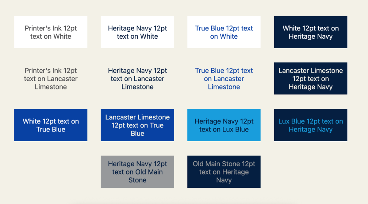
These combinations pass the highest standards and can be used for any text size, small or large, as well as icons and buttons.
- Printer's Ink (85% Black) or Heritage Navy text on a White or Lancaster Limestone background. (Our default recommendation for website and newsletter body copy).
- True Blue text on a White or Lancaster Limestone background.
- White or Lancaster Limestone text layered over a solid Heritage Navy or True Blue background.
- Heritage Navy text layered over a Lux Blue or Old Main Stone background.
- Lux Blue text layered over a Heritage Navy background.
- Old Main Stone text layered over a Heritage Navy background.
🟨 Yellow Light: Use Only for Large Text & Headlines
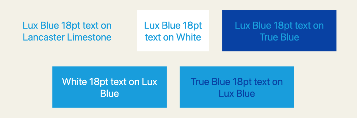
These pairs have enough contrast for big, bold headings (18pt and larger), but should never be used for long paragraphs or small body text.
- Lux Blue text on a White, Lancaster Limestone, or True Blue background.
- True Blue text layered over a Lux Blue background.
- White text layered over a solid Lux Blue background.
🟥 Red Light: Do Not Use (Fails Accessibility)
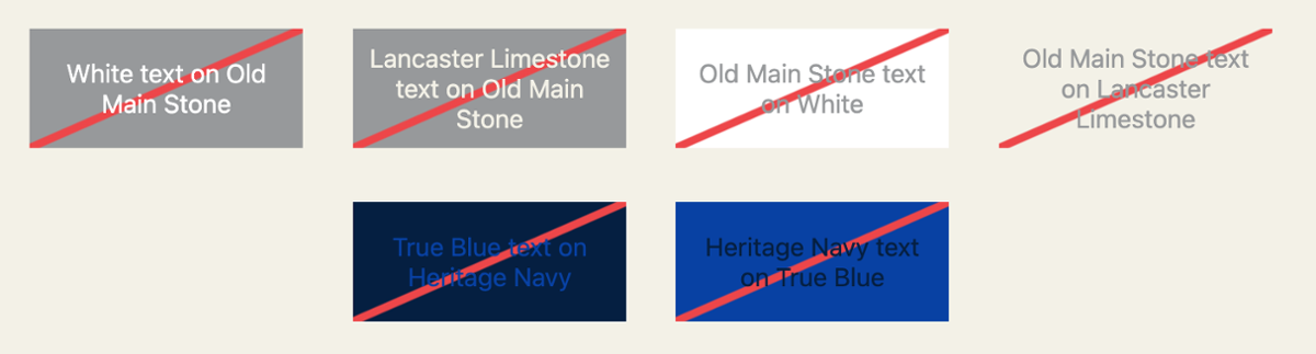
These combinations bleed into each other and make text incredibly difficult to read. Avoid these entirely on screens.
- White or Lancaster Limestone text layered over an Old Main Stone background.
- Old Main Stone text on a White or Lancaster Limestone background.
- True Blue text layered directly over a Heritage Navy background (and vice-versa).
Unsure? Test the Contrast
If you are designing a custom graphic or setting up a digital flyer and want to double-check your colors, you don't have to guess. Paste your background and text color HEX codes into the free, web-based WebAIM Contrast Checker to get an instant pass or fail result before you publish.
F&M Brand Guide