
Fonts
Fonts are a powerful, silent brand ambassador. The specific typefaces we select give voice to the Franklin & Marshall identity, reinforcing our academic rigor, institutional heritage, and contemporary outlook.
By using our designated font families consistently across print and digital media, we ensure that every communication feels cohesive and distinctly F&M.
Inter and Inter Tight
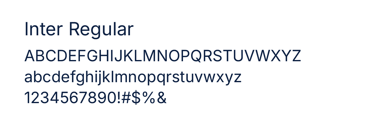
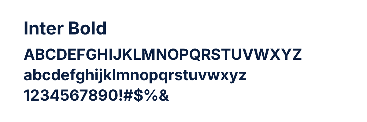
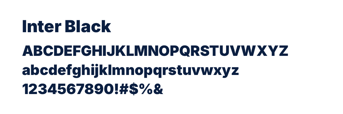
Designed specifically for screens but highly versatile in print, the Inter family is our primary san-serif font and the main font used at F&M. It is modern, geometric, exceptionally legible at small sizes, and clean.
The Role
Functional Copy
Best Used For
Subheads, short text blocks, bulleted lists, charts, user interfaces, and mobile app layouts
Why
Inter's open spacing ensures maximum readability even on small mobile screens or dense print layouts
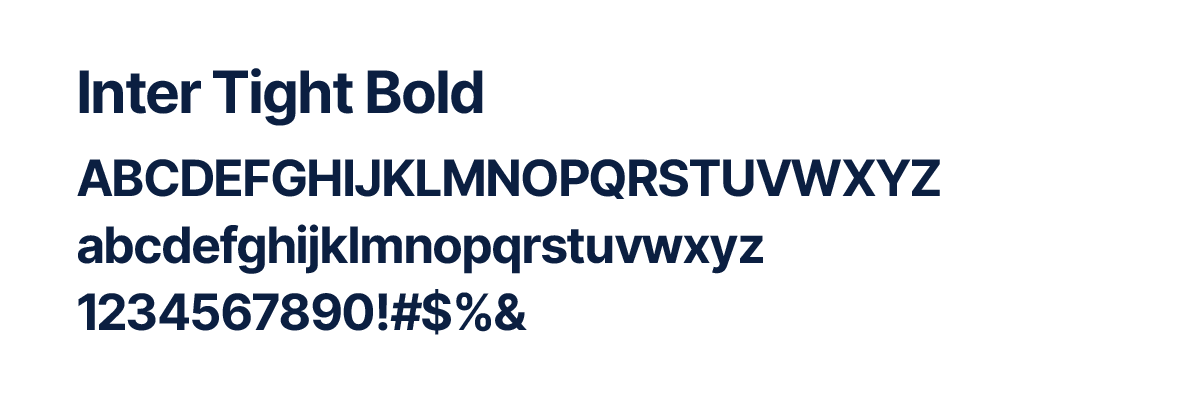
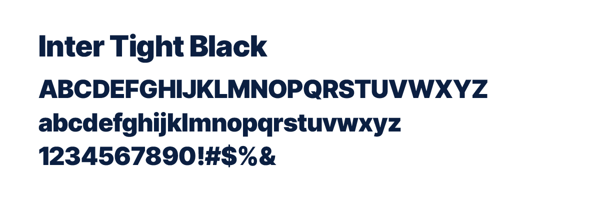
The Role
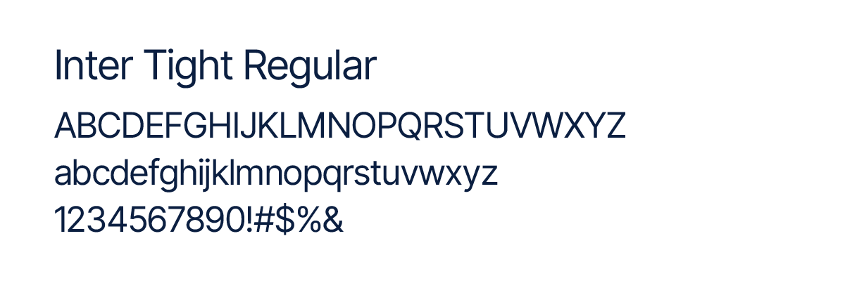
Display and Headlines
Best Used For
Large page titles (H1), section headers (H2), and high-impact callouts
Why
Inter Tight features slightly condensed character spacing, making it look sharp, intentional, and balanced when scaled up to larger sizes
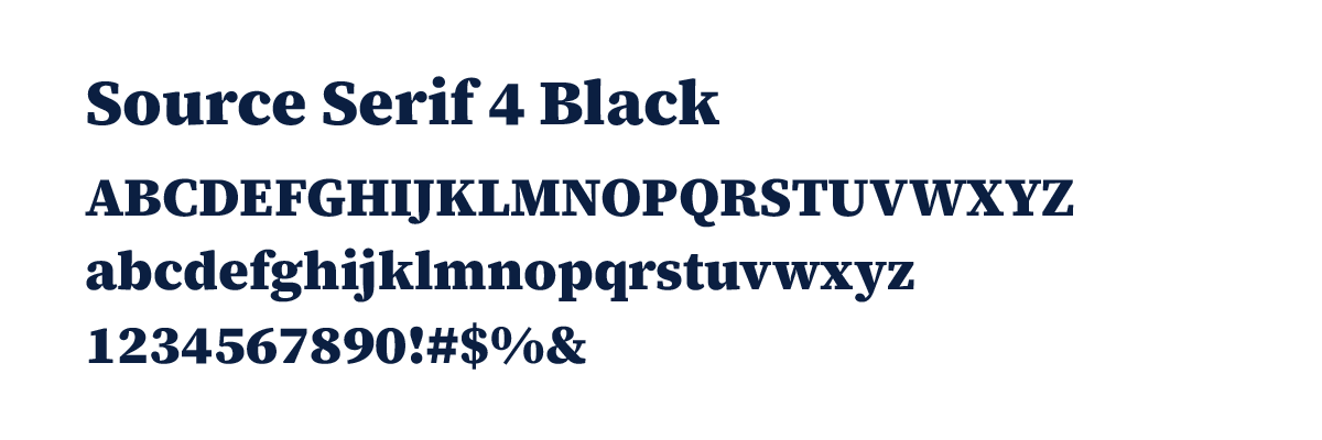
Source Serif 4
Our official serif typeface brings an intellectual, classic, and narrative grounding to the brand, nodding to F&M's historic roots while remaining thoroughly modern.
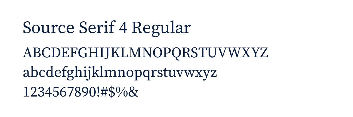
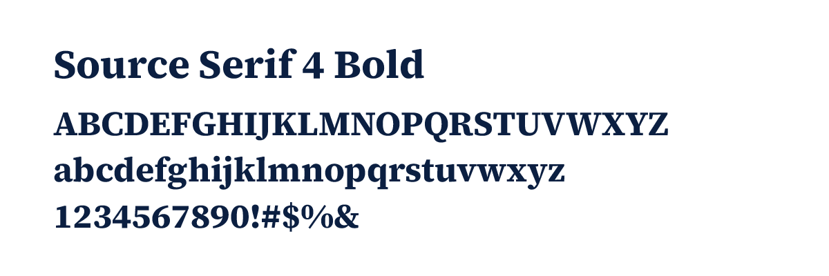
The Role
Editorial and Long-Form Text
Best Used For
Body copy in magazines, formal letters, long-form web articles, academic program descriptions, and ceremonial documents.
Why
Source Serif 4 was sculpted specifically for digital environments, meaning it retains its classic, scholarly character without sacrificing clarity on digital screens.